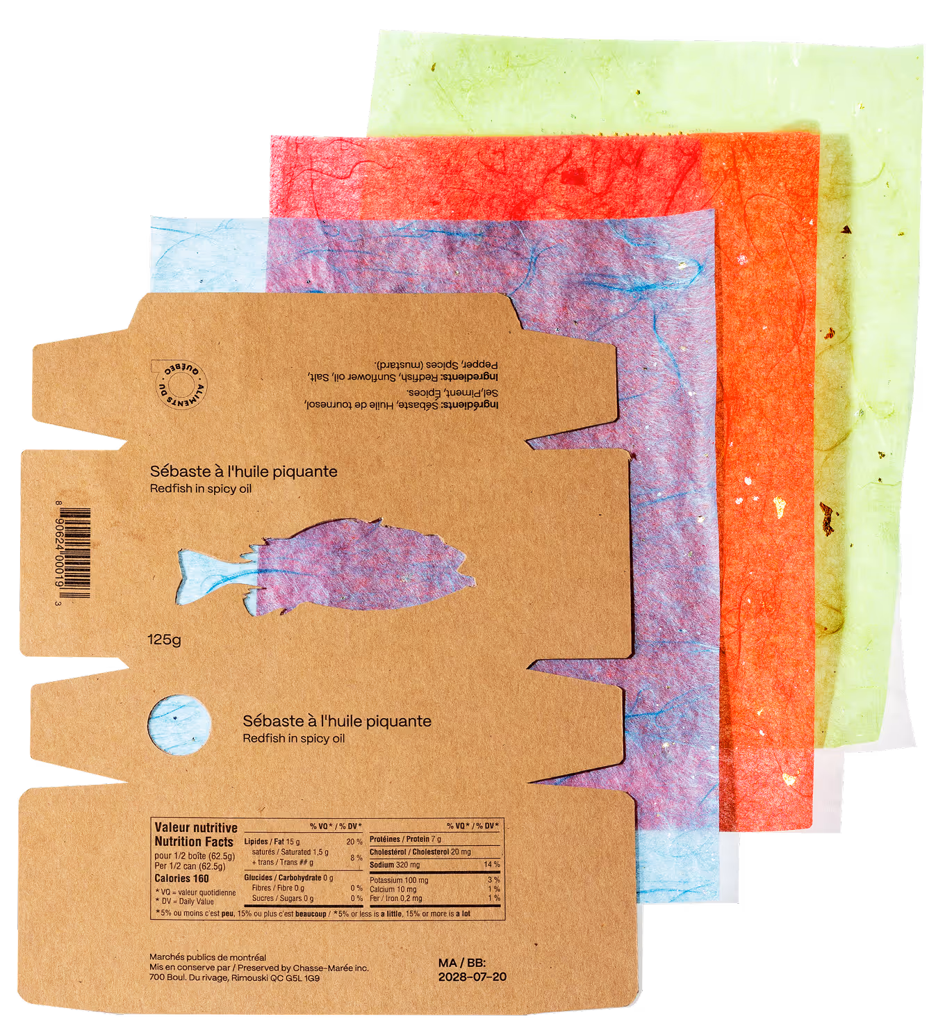
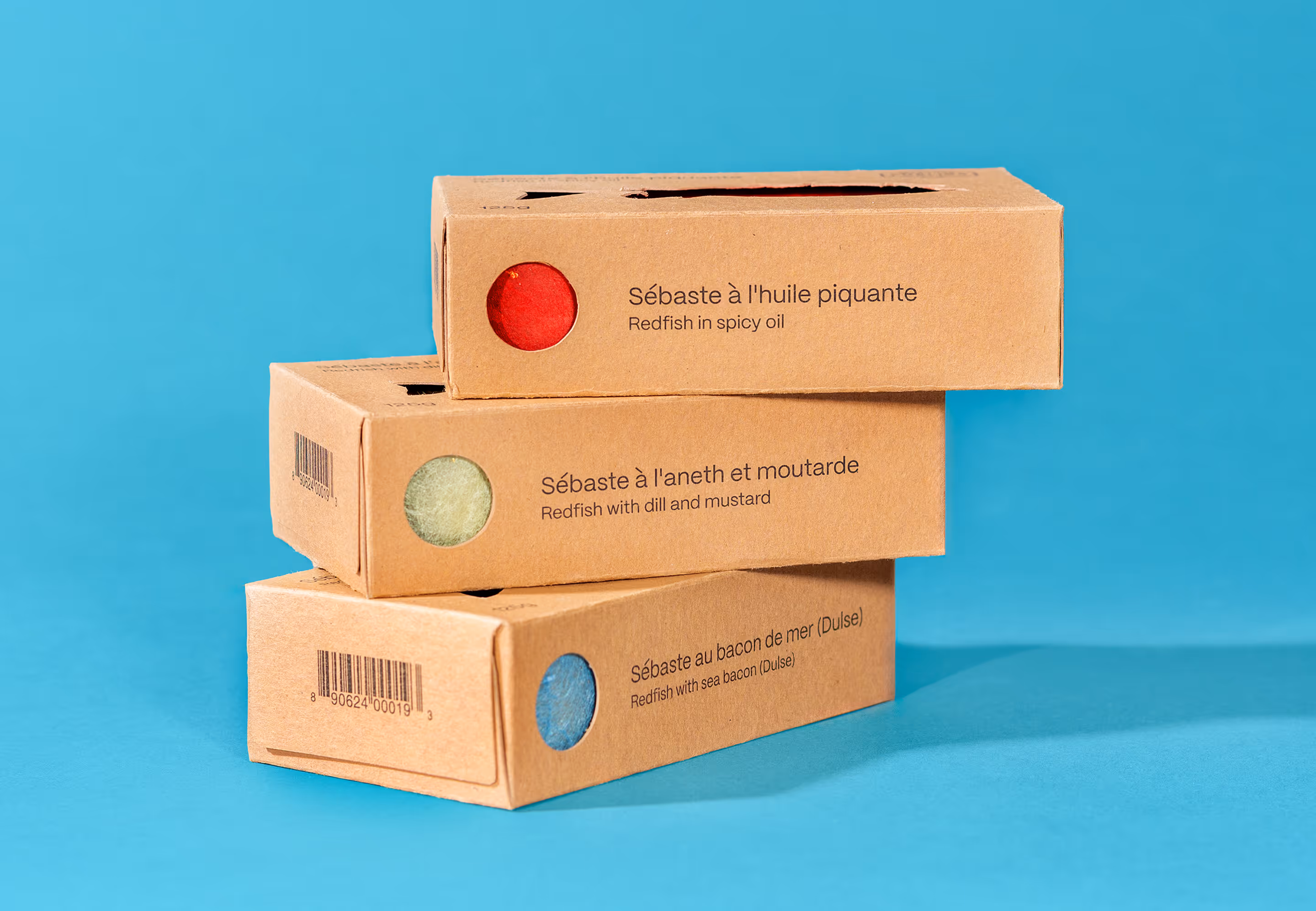
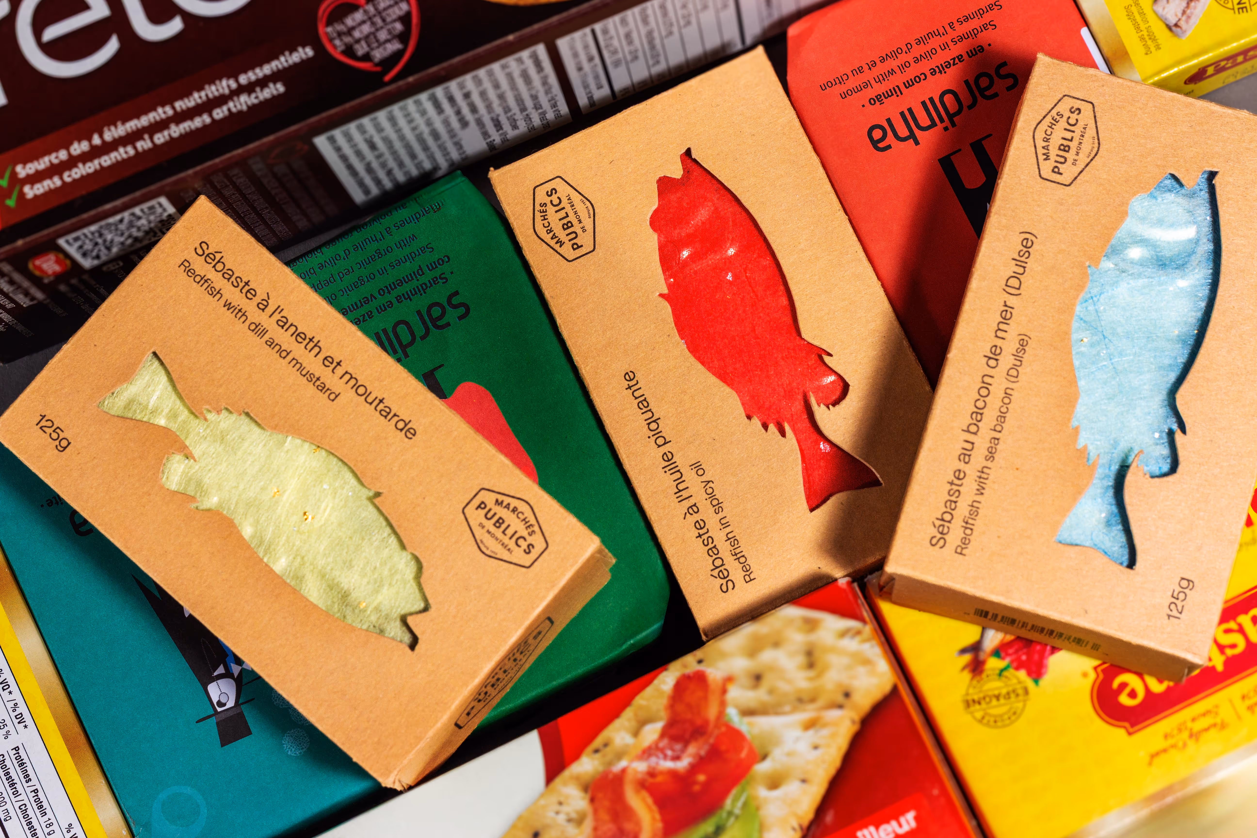
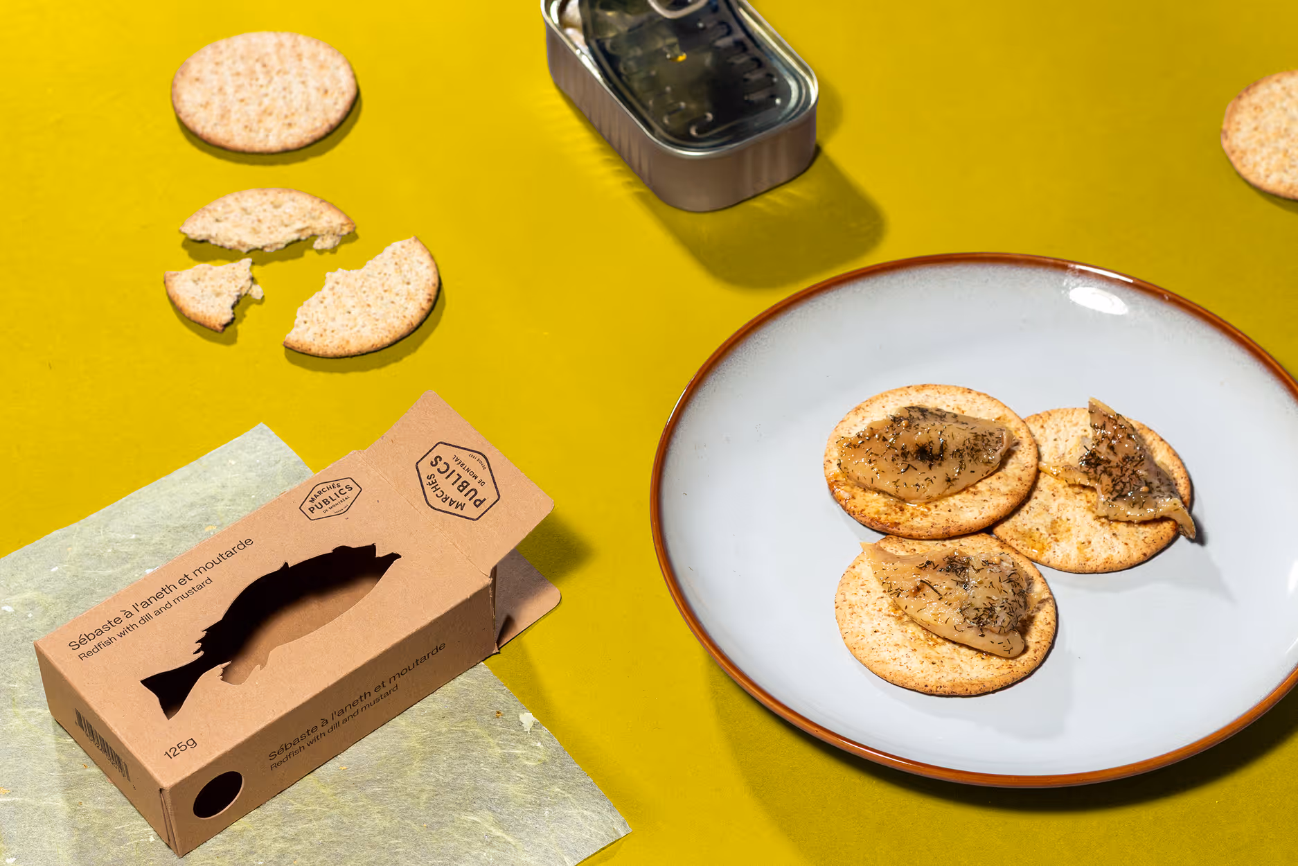
The brief is to create a flexible tinned fish packaging system for Les Marchés publics de Montréal, celebrating the local nature of their product. Challenges include creating a standardized packaging system that can accommodate multiple flavours, as well as creating packaging that's attractive to millennials with a moderate disposable income who want to eat a healthy, quick snack on the go.


I experimented with different materials for wrapping the tin cans; in the end, I chose Japanese paper as it is slightly translucent and contains metallic pieces. The materiality of the Japanese paper in conjunction with the metallic tin creates a water like visual. I chose red, green and blue paper to represent the flavours of red chili oil, dill & mustard, and dulse. The outer packaging is minimal, to let the colours of the flavours stand out through the die cuts. The rectangular box shape allows for easy shelf placement, from either an upright or sideways position, while also being able to understand what variety of fish is being sold at a glance.


